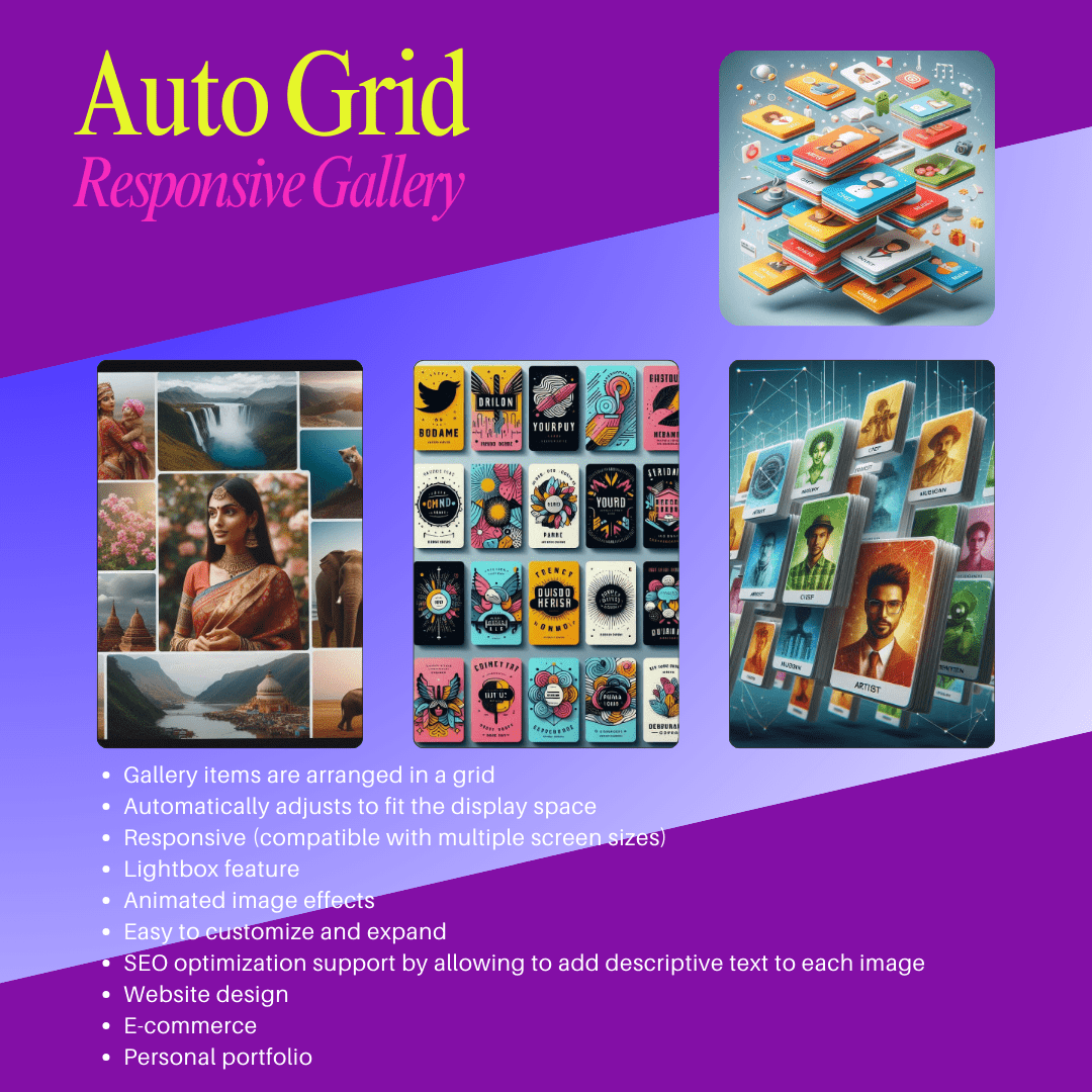
Auto Grid Responsive Gallery is a web interface design tool used to display images, videos or content in a grid and automatically adjust their size and layout to suit the screen size of the user’s device. This helps ensure that the content is displayed optimally, without being skewed or unbalanced, and can interact well on many different types of devices such as desktops, tablets, and mobile phones.
The main features of “Auto Grid Responsive Gallery” include:
1. Automatic grid layout:
– The items in the gallery are arranged in a grid. When the screen size changes, these items will automatically readjust to fit the display space, helping users to view easily without having to scroll horizontally or adjust the screen.

2. Responsive (compatible with multiple screen sizes):
– Responsive technology allows the gallery to automatically change its layout when displayed on devices with different resolutions. For example, on a desktop screen, images can be arranged horizontally with multiple columns, while on a mobile device, the number of columns can be reduced or elements arranged vertically to fit small screens.
3. Automatic resizing:
– Images and videos in the gallery will be automatically resized based on the size of the container and the user’s screen. This helps optimize the display space and ensures that no images are distorted.
4. Lightbox feature:
– Some versions of Auto Grid Responsive Gallery come with a lightbox feature, which allows users to click on images to view them in larger sizes without having to open a new tab. Lightboxes often come with smooth transition effects, creating a better user experience.

5. Animation effects:
– Many galleries support animation effects when users scroll the page or interact with the gallery. These effects can include fading, zooming in/out, or rotating, making the gallery more dynamic and interesting.
6. Easy to customize and extend:
– Users can customize how the gallery is displayed, including changing the number of columns, spacing between images, background color, and other options through CSS or configuration options.
7. SEO support:
– Some versions of “Auto Grid Responsive Gallery” support SEO optimization by allowing to add descriptive text for each image, helping search engines read and rank the website better.
Applications of “Auto Grid Responsive Gallery”:
– Website design: Widely used in product introduction websites, image catalogs, personal websites, portfolios, blogs, and websites that need to display many images/videos.
– E-commerce: Auto Grid Responsive Gallery is very useful for e-commerce websites that display product collections.
– Personal Portfolio: Designers, photographers, or artists can use this tool to showcase their work visually and beautifully on a variety of devices.
Popular tools that support “Auto Grid Responsive Gallery”:
– Masonry: A JavaScript library that automatically arranges elements in a grid layout without being limited by fixed rows and columns, creating a more natural and flexible grid effect.
– Justified Gallery: A library that arranges images in the gallery so that they fit the width of the container without distortion.
– Flickity: A tool that helps create carousel-like image or video galleries with many responsive features and smooth effects.
Benefits of using “Auto Grid Responsive Gallery”:
– Enhance user experience: Thanks to its compatibility with many devices and screen sizes, users will have a better viewing experience, easily searching and browsing content.
– Enhance aesthetics: The grid layout and visual effects make the gallery look more professional and eye-catching, making the website more attractive to visitors.
– Optimize performance: Most galleries are optimized to minimize resources, ensuring the website loads quickly and smoothly.
Conclusion:
Auto Grid Responsive Gallery is a useful solution for creating image and video galleries that are compatible with many different types of devices and screen sizes. This is the ideal tool for those who want to display multimedia content professionally, flexibly and user-friendly on web platforms.


 Tiếng Việt


Reviews
There are no reviews yet.